Sunday, 31 January 2010

Feedback central

We are getting to the stage in our production now where audience feedback is vital, therefore in our lesson on Friday we asked a few of our fellow students at 6th form (who happen to also be part of our target audience, young adults) to come in and give their opinions in some small focus groups, covering not only our music video but also the anciliary tasks tooo!

Firstly when looking at the webpage comments were made about a large pink banner we had, and that it drew attention away from the photo of Santigold - we also agreed with this and then moved a few things around a made the banner smaller and complimented it with a grey part and it now supports the photo rather than overwhelming it.

With the Digipack responses were generally very postive, everyone liked how we used photos taken on location and that they made it seem very professional and of a high quality.

We then asked more direct questions about the music video:
  1. Which part or parts stood out the most to you?

- the reverse shot of the cards (personal favourite of ours too, was great as we also learnt new technology to produce it so it was great to get postive feedback for that!)

- shot which involves a frame in the stones and lorna in the distance within :)

- change, change, change :) this was one of our favourites which is the part which included the masks and lots of effort was put into it, so it was great to hear good stuff being said about it.

Criticisms!

- one line where lorna looks directly at camera, outside cinema not sure if this goes well with the rest of the music video (we had also highlighted this as a point to go back to, so glad that we're agreeing with the audience feedback)

- middle part with the umbrella needs to be of a faster pace (this will be achieved through lots of extra editing sessions until we get it perfect, tomorrow after school in fact, one of many!!)

we shall give more audience feedback after we've moved further along with our project's :)

Looky here...It's a digipak analysis!

This is the debut solo album from Babyshambles front man, Peter Doherty. Released March 16th 2009, the album did not sell as well as was predicted - only reaching 17 in the top 40 album chart. However, rock/indie magazine 'Q' stated the album was impressive and awarded it 4/5. The Guardian also gave positive reviews and claimed that this album says "Goodbye to Pete Libertine the Rehab King, and say hello to Peter Doherty, outstanding singer-songwriter and charismatic poet-vagabond. It's a pleasure finally to meet him". Pete Doherty has always excelled himself with lyrics, even with former band 'The Libertines'. Being a fan of Doherty, i may be bias in saying that i think the album exceeded my original expectations and even though Doherty’s voice has been damaged by drug use, these tracks are poignant and meaningful. This digipak consists of the audio CD, DVD of extra performances, and a booklet in the centre with illustrations and lyrics. It is made from a rigid glossy card material.

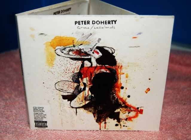
Here is the front cover
Photobucket

We are initially struck with this imposing graphic design image of a woman with a burnt orange/brown/yellow colour scheme that runs throughout the digipak. This is also the design sold on t shirts to launch the album and his solo career, using this deisgn will allow people to realise it is from this album!
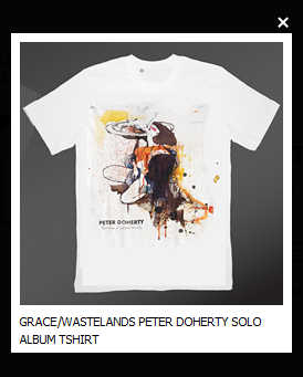
Photobucket

The fact that Doherty isn't on the front cover i would say is slightly inconventional however, more recently i think it has become more common for artists to do this, but then have some kind of image of themselves inside the package. (which we then go on to see) His name is in capitals but the font is quite small and therefore your eye is not drawn straightway to this, underneith is the name of the album 'Grace/wastelands' which is in a fine handwritten style font (handwritten being the style we have also gone for) but could be easily missed at a glance! The parental advisory sticker on the front along side the informative 'CD/DVD special edition' is recognisible with regard to CD packages and therefore know there will be strong language either on the CD or DVD.
Photobucket

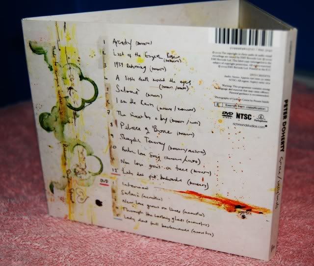
This is the backcover of the digipak, once again keeping to the graphic design colour scheme and the handwritten names of the tracks particuarly stand out to me, because this is a key feature i think works with this individual artist - it creates more of a personal touch! :) Another thing i think we haven't mentioned until now is the barcode!....we need to include that! otherwise how would people buy our wonderful digipak!...here it is at the top right, slightly inconventional (as it is usually in either of the bottom corners) BUT i like it!
Photobucket


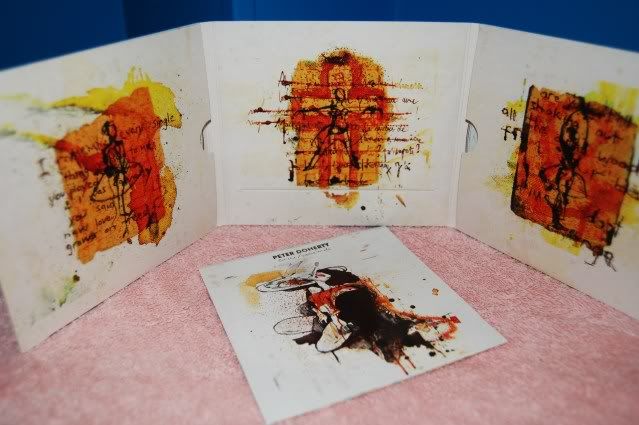
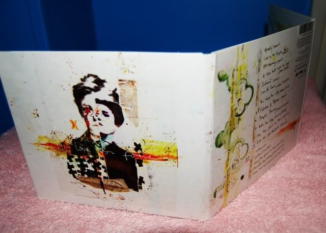
Here is the entire digipak opened up, and the front cover of the booklet inside which has song lyrics (handwritten) and further graphics. Each panel inside commits to the recurring colour scheme but has 3 images of a ballet dancer, which is relevant to one of the songs (and could also be relevant to the dancers her had at his live shows) Some lyrics from the tracks are also written across these designs again in a handwritten manner which i think works well!
To either side of the centre panel you can see the slots for the CD and DVD and at the bottom of the centre panel there is a long slot where the booklet goes, i think this is a very neat and well processed design!
Photobucket

This digipak has an extra panel (similar to ours!) which has yet another illustration, this time of Doherty himself (even though slightly distorted!) i like the black jigsaw pieces that make up part of his torso, its kinda quirky! :)

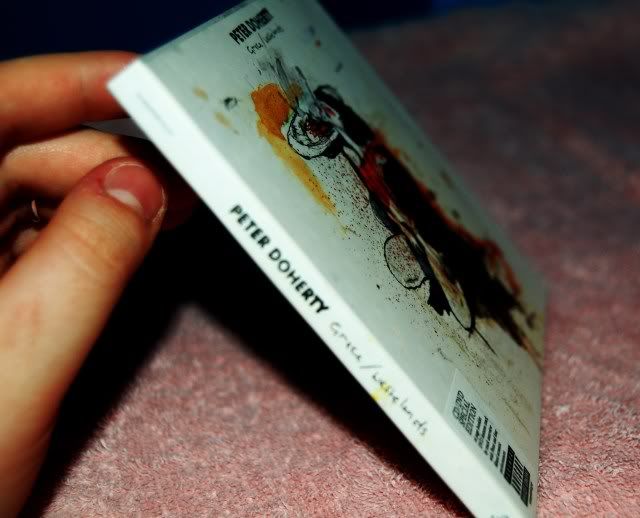
Finally, here is a photo of the spine - this is a very important aspect of the digipak design because most CD/DVD holders only show this part and therefore needs to be easily accessed and recognised
Photobucket

This one clearly displays the artist and album name, overall i think this is a good example of a digipak for an individual artist, my favourite features being, the handwritten fonts and the general layout :)
Thanks for reading, Lorna.

Saturday, 30 January 2010

Analysis of web page (Pixie Lott)

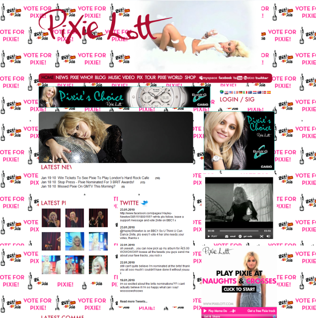
I've decided to look at Pixie Lott's web page for the reasons being that she has only been on the music scene officially since the spring/summer of last year (2009) but has reached incredible success over the last 6 months, not just in the UK. Only last year, she was nominated for 3 times at the MTV Europe music awards and then went on to receive 2 of these, including 'Best UK and Ireland act' as well as 'Best push act'. Having established her career successfully she has also been nominated 3 times at this years Brit award ceremony. These include; 'Best Breakthrough artist', 'Female solo artist' and 'British single'. The genre that is mostly associated with Pixie Lott is pop, soul, r'n'b and sometimes electropop. I've chosen this particular web page because after researching a few this one stuck to us as a group when deciding on what features we want to include on our own Santogold page. here is a screen shot from the web page, notice the background has been changed for the period of time in which Pixie Lott's audience can vote for her on the Brit awards.

Photobucket

At the top we see a constant moving image of Pixie herself next to the web page headline 'Pixie Lott'. As we'd expect, the headline is the largest font we come across on the page, it also has a hand drawn appearance which we have incorporated into not only our web page, but also the digipak therefore keeping consistency within our products! :)

Photobucket

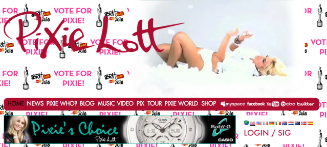
This still from the web page highlights the large font typography for the headline banner and also the navigation bar with relevant links you may expect to see on a musicians web page. These include 'news' and 'tour' which are the more obvious links that would take you to more information on what's currently happening with regard to her career and when you can see a live show/performance.
I liked the use of Pixie's name incorporated into the links here, such as 'Pixie who?', 'Pix', and 'Pixie World' these are features that particularly stand out to me because rather than simply saying 'biography' it's making the reader become more intrigued. At the end of the nav bar, there are links to follow Pixie's Facebook, Myspace, Youtube, Bebo and Twitter - this demonstates web 2.0 where we, the audience can get involved more and communicate instantly with the use of blogging and social networking. It also demonstrates the postmodern world we now live in where we can view videos/picture of our favourite artists whenever we like via the internet.

Photobucket

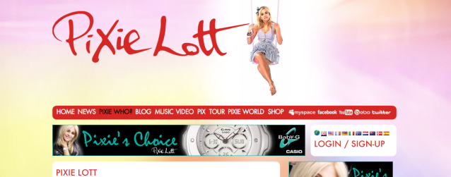
With every link you click on the back ground and colour scheme changes, adding variation to the web page as a whole, we will not need to do this as we are just creating the home page, but if we were to do so this would be a successful idea in my opinion because it keeps the audience's attention to detailing.
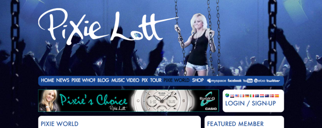
Here is a still from the 'Pixie World' page which again has a change in colour scheme but also reads that you have to be a member or signed up in order to visit this world. This is interesting because even though it is free to sign up, the audience have to commit to this web page for further information and gossip!

Photobucket

On the homepage i found it quite unconventional to see an artist promoting a product which isn't entirely theirs, here Pixie advertises the 'Baby-G' watch company not only in a banner at the top of the page, but also in a box to the right. Both of these advertisments are on the home page and are in a contrasting teal and black colour scheme as opposed to the pink and white of the general layout. This is a feature i would not want to use in our own web page.

Overall, the key highlights for me that i have taken into account for our product is the navigation bar links and general layout e.g) having the main headliner's name at the top, nav bar underneith, columns to the side and boxes underneith. This web page is easy to access which is a vital factor :)
Thanks for reading! Lorna.

Wednesday, 27 January 2010

more of the website variety...

I analysed one of Paloma Faith's music videos earlier on in our music video research therefore I felt it was appropriate to look at her web page too and take some inspirtation from it and also to show how ours might differ too.


Firstly I looked at the links which are available on the website, they are set out in a simliar way to which we have developed ours using the standard pages e.g. Gallery and News. We however altered this to make our webpage seem more personal to the audience and also reflect the quirky nature of Santogold, but using links such as Santoworld.


Something on the webpage which particularly caught my eye was the links to the social network site 'Twitter' - Here we can see Paloma's most recent updates, this allows her audience to feel more closely invloved with her and will therefore improve her fan base. I think this is a great idea however I do not feel it would be suitable for our webpage as it reflects a more open artist and I think therefore would not go well with the quirky nature of Santogold that we have implied throughout our work. (below is an example)


Another part of the webpage which I found appealing was the 'News' section where by fans are able to comment on Paloma's News. I think this is an effective way of making the webpage more interactive and allows Paloma and her record label to see how people react to some of Paloma's posts. I would love to atempt to involve this in our webpage however I'm not sure how effective it would be and whether we would be able to design the right structure, it something as a team we shall discuss :)


Thanks for reading :)


Saturday, 23 January 2010

Feelin' a bit GaGa.

Helloo party peeps :)
I'm going to be discussing Lady GaGa's "Fame Monster" digipak CD. As we have chosen to create a digipak as one of our auxiliary task options I will be discussing and using Lady GaGa as an example of the features of digipaks and advertising techniques used to describe how we are creating ours.
A digipak is a style of CD packaging with one (and often more) disc trays, which is folded in a particular book like style. It folds out into three squares as shown below. Therefore it has six sides for us to design (including back and front).


Lady Gaga's digipak is a full plastic tray case which holds paper images and the CD, however there is also "Soft Spot" digipaks which are made from folded cardboard. I think it is more likely that we will use the latter, by printing off our final images onto a template like the one below and folding it accordingly. However we may well use a plastic tray if we can find a good one, we havn't decided yet :)


One feature of Lady Gaga's digipak that I really like is the photographs used on the front and back of the case:


I feel they are really striking and would attract a potential buyers attention. We have chosen similarly visually arresting images for our digipak so as to attract a wide target audience. I feel the image we have chosen for our front cover would be attractive to a potential buyer whether it be on a shop shelf, iTunes or a website such as Play.com. I think the image will appeal to the alternative music audience as it is quite "arty" yet is also a classically beautiful image and will appeal to a mainstream audience:


I also really like the bold writing used on the CD and on the inside of the digipak. We have used a Bamboo pen tablet of Lorna's to create our own writing which has more of an individual, handwriting feel to it. The tablet allows you to write onto a touch sensitive pad with a pen and the image gets transferred onto the computer (we have used Illustrator to do this).


We have used the same style of writing for our webpage aswell. Personally I like that our webpage, digipak and music video have themes throughout yet all have fresh differences as I feel this really helps to promote Santigold as our own "brand". When we create our final plan/template for our digipak I think we will be using either Illustrator or Photoshop or a mixture of both.

The difference between our digipak and Lady Gaga's is that we will not be creating a booklet for the inside of the case. However we are trying to create that look and feel by using our favourite and most visually attractive photos from the day of our shoot, like this one:

We also want to create some writing over our images such as "thankyous" or lyrics which are often found inside digipaks. Here is an example of how Lady Gaga incorporates writing into her digipak:


Thats all for now but pretty soon we will be uploading images of our actual digipak and our webpage which just needs the final touches added now! Excitiiiiiing! :D :D :D xxxxxxxx

Sunday, 17 January 2010

Analysis of Ellie Goulding's Website

Ellie Goulding is a relatively new on the scene singer who is currently signed to Polydor records, the same record company as widely popular stars e.g Lady GaGa and Duffy and also lesser known artists such as Jamie Scott and Jack McManus. At the moment she is not very well known which is why I decided to analyse her website and see how it differs from bigger names such as Katy Perry's website. I came to know her music through one of iTunes weekly free downloads (which is where i also heard of Jamie Scott and Jack McManus) and she recently won the Critics Choice Award at the 2010 Brit Awards.
I felt that i could compare and take inspiration from Ellie Goulding's website as both she and Santigold have a more alternative sound and therefore would have a similar target audience. Here is a link to her website :
On first glance Ellie Goulding's website is very similar to a MySpace page, with samples of her tracks to listen to and YouTube clips of all her TV appearances and behind the scenes video diaries. I like this idea as it makes the audience feel closer to her and more able to identify with her, more so than they could with bigger name artists who are more likely to have video clips of their performances rather than direct address to their online audiences. It also shows that she is an up and coming artist who is till trying to promote herself as much as possible. This is also shown through advertising of her Twitter and MySpace pages.
Similarly to Pixie Lott's website http://www.pixielott.com/site/global/frontpage?cmdr=ip2country/detected, who we have been looking at for inspiration for our auxiliary task webpage, she has a menu bar at the top of the page giving options such as "about" and "gallery". I particularly like the gallery of official photos and we have used a favourite photo that we took of Lorna as a background for our webpage. Here is an example of one of the photos I especially liked:


I particuarly like the moving images on the background of the page as I think it gives an added interest apart from the generic features of a webpage. However I don't like the fact that adverts for her shows and voting polls have been placed over this feature as I feel it takes away from a good technique. If we had the technology or were making a live webpage then I think we would use this technique of moving, slideshow style images due to the great photos we took on our shooting day which would be perfect for promoting our artist.
Overall I feel this is a a successful webpage and works for Ellie Goulding's target audience who are probably young people into alternative msuic and therefore are more likely to search for new artists on the internet.

More to come later :) xxx

p.s Editing is coming along really well and we're managing our time pretty well and think we're going to be more than ready for the deadline :D :D

Saturday, 16 January 2010

Textual Analysis (Lily Allen)

'22' was directed by Jake Scott, the son of Ridley Scott. He is an English director who works mostly on music videos and has therefore worked with the likes of Soundgarden, The Smashing Pumpkins, U", R.E.M and The Strokes.
Here is the link! please copy and paste into the url bar & check it out :) http://www.youtube.com/watch?v=tWjNFC-FinU

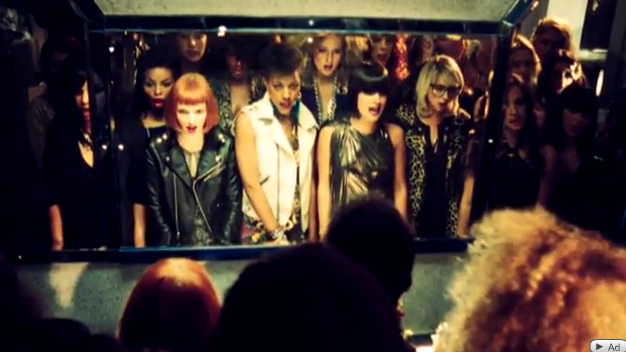
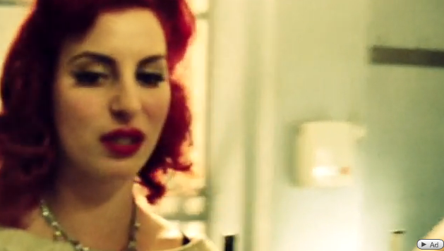
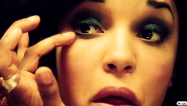
I think this is a concept and performance based video. The performance element focussed on the lip syncing throughout not only with Lily, but also the girls looking in the bathroom mirror
Photobucket
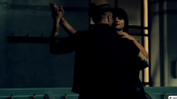
Another key performance aspect is the dance routine between Lily and a mysterious man in the bathroom about two thirds of the way through the song as it comes to an end.
The song is conceptual in the way that Lily Allen attacks the assumption that a womans life is over once she's past a certain age. The video features Allen as both a young woman on a night out and as an older woman doing the same when they 'shouldn't' because they're past their youth.


MISE-EN-SCENE

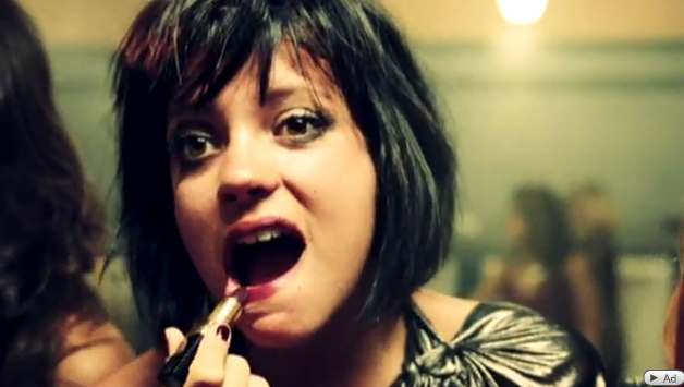
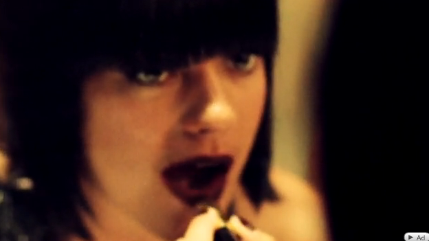
The majority of the video is set in the ladies bathroom of a nightclub, the room is dominated by women going in and re-applying their make-up and sorting out their hair, which most women can relate to when going out for a night out. The glamorous costumes/hair/make-up worn by all the women suggests they are on a night out. There is sometimes a quick glimpse of a glass with a drink in it suggesting they are in a nightclub, I think Allen's key prop in this video to portray the idea of appearance is the lipstick she uses to re-apply later on in the video when Allen is trying to show the 'older' woman who is worn out and messy but doesn't realise what kind of state she is in, here are two shots showing the younger "in controll" Lily, and then the older "out of controll"

Photobucket
Photobucket


mirrors are an essential prop in this video as they reflect the representation of self image and how important it is to these women, also the point of view shots when Allen is looking into the mirror focusses the audience into what she is seeing.
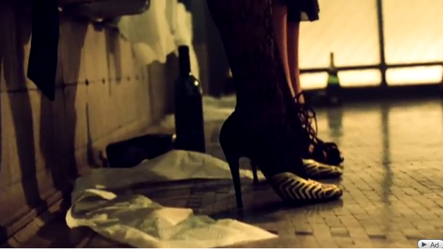
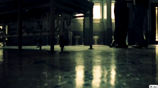
This low close up of a woman's legs again shows that she is dressed up (with the high heels) but also the smaller detail such as the toilet roll and wine bottles on the floor confirms it is a bathroom they are in and that they are all getting drunk in the club or bar where ever they may be.

Photobucket

CAMERA

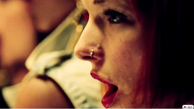
Jake Scott uses a lot of facial close ups that show expressions of Allen and the women in the bathroom, this particular shot shows the 'bitchyness' of how sometimes women look and judge eachother and is likely to happen in the bathroom where they are all applying their make-up and making adjustments.

Photobucket

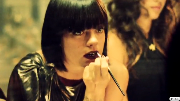
This over the shoulder close up shows Allen putting on her lipstick and staring into the mirror where her former, younger self is doing the same in the reflection. Then the 'younger' Allen continues to sing the song, therefore leaving the 'older' Allen to put on her lipstick.

Photobucket

There is no obvious change in Allen's appearance throughout the video even though the concept about the young and old, however the messier look alone still manages to convey this idea without making it too blunt with using prosthetics etc.

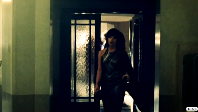
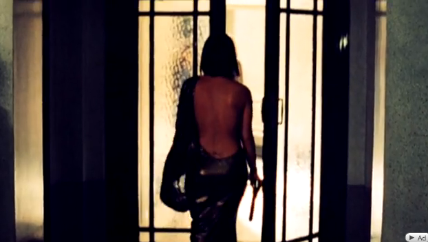
These wide shots signify the begining and closure of the song, firstly with her walking into this bathroom where she spends the entriety of the video, and once again after the final singing piece into the mirror when she then walks out of the room and off into the distance. As the music fades out the audience are aware this is the end.

Photobucket
Photobucket

EDITING
With regard to the edits in this video I have established that this video consists of straight cuts which are generally fast paced and rapid. These edits used throughout keep the video flowing at a realistic rate and doesn't confuse the viewer with time and space elements and is therefore not a post-modern text. As Allen approaches the large mirror in the bathroom, the camera forcuses on the reactions of the women around her, this particular sequence is very pacey and allows the audience to capture a glimpse of the womens reactions. Also the edits not only focus on Allen singing into the mirror at this point but also the other women arround her that are applying makeu-p, this gives the audience awareness that she is surrounded by lots 'vein' appearance based women.

Photobucket

Photobucket

One convention often recognised in music videos is direct address to camera, even though Allen does not look straight into the camera, she often sings into the mirror, looking slightly off the camera but still engages with the audience. These close up mirror shots fit into one of Goodwin's six in the way that the use of close ups is very dominant for star status, and even though Allen is well recognised this still emphasises this!

SOUND
Goodwin says that music videos can have a link between lyrics and visuals. In the first verse, Allen sings "When she was 22 the future looked bright, but she's nearly 30 now and she's out every night. I see that look in her face, she's got that look in her eye, she's thinking how did I get here and wondering why". These lyrics alone link to back to not only the visuals of Allen in the nightclub as her younger self, and the 30 year old.
After the last chorus, we then see Allen dancing around the central sink in the empty bathroom with a handsome man, this particular dance is significant to the video because it is something we haven't yet seen and breaks up the performance based style. However, after this sequence it cuts back to Allen alone at the mirror and therefore implies that the dance was all a figure of her imagination. The dance sequence is broken up with close up shots of Allen and her mysterious man's feet as they dance. This is something we have used in our own music video, a variety of shot types so keep the viewer engaged.

Photobucket

Photobucket

Thanks for reading, Lorna. :)


Friday, 15 January 2010

Target Audience and a little bit extra :)


Hey, I wanted to start a little research into target audience! I decided that in order for me to establish the specific target audience for Santogold and other female artists like her that I should read some articles written about them.

Firstly I found an interesting piece written by the New York Times, titled 'Hip-Hop’s Newest Faces: Indie, Fierce and Female' which I thought was helpful and very relevant to our Target Audience research as we've been focusing on Indie, Fierce and Female artists, with a bit of sass too!! It was within this article that I found an excellent quote surrounding why these female artists and their new styles are so popular “And it’s because they have such strong voices and strong points of view. There’s nothing remotely manufactured about them.” This I feel is incredibly important as it allows Santogold to appeal to a large amount of people without the restrictions of being labelled 'manufactured'. This is supported by Martin Heath who said that “She appeals very broadly" and he is the founder of Lizard King Records who is jointly releasing Santogold’s debut album with Downtown. His opinion is therefore valued highly.

Santogold is a young female artist and therefore we assume her target audience would be people aged 14-30. More specifically female as a lot of her lyrics are tailored towards female issues such as when 'she' sings about reletionship troubles.

more to come..

Thursday, 7 January 2010

Web Page Research :)

It's snowing outside and I thought I'd come on here and do a little research as we are moving now onto our Web Page anciliary task! I have decided to look at the first artist I did some textual analysis for and that is Katy Perry. Here I looked at her Web Page (http://www.katyperry.com/) for some ideas. Below is a print screen of the whole opening page:

In the first stages of Web Page production we looked at using iWeb on the apple macs at 6th form. This seemed like a great idea and would allow us to learn how to use a new program. However I was baffled as to the small size of the standard page on iWeb, but after looking at this Katy Perry page it seems that the small size is not irregular and it just means for other pages to lead off of the main site. I especially like the use of a performance based photo in the centre with black outlining. I think it draws attention towards Katy and also makes the reverse out writing for each addition e.g ENTER WEBSITE or MTV.COM stand out more clearly in pink/white over black. I furthermore like the idea of promoting our arist 'Santigold' using merchandise. Here the KP website has an advert for this and her 'official store' at the bottom. I especially like the sunglasses :)

This is just one artists page I have looked at and will find more soon :)