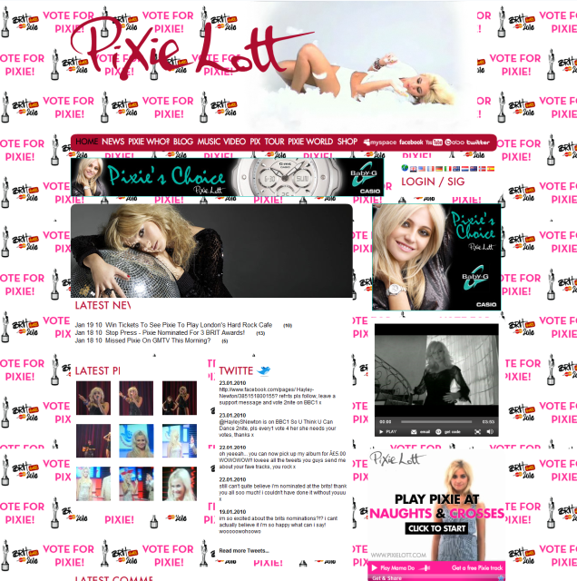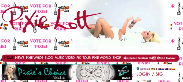
At the top we see a constant moving image of Pixie herself next to the web page headline 'Pixie Lott'. As we'd expect, the headline is the largest font we come across on the page, it also has a hand drawn appearance which we have incorporated into not only our web page, but also the digipak therefore keeping consistency within our products! :)

This still from the web page highlights the large font typography for the headline banner and also the navigation bar with relevant links you may expect to see on a musicians web page. These include 'news' and 'tour' which are the more obvious links that would take you to more information on what's currently happening with regard to her career and when you can see a live show/performance.
I liked the use of Pixie's name incorporated into the links here, such as 'Pixie who?', 'Pix', and 'Pixie World' these are features that particularly stand out to me because rather than simply saying 'biography' it's making the reader become more intrigued. At the end of the nav bar, there are links to follow Pixie's Facebook, Myspace, Youtube, Bebo and Twitter - this demonstates web 2.0 where we, the audience can get involved more and communicate instantly with the use of blogging and social networking. It also demonstrates the postmodern world we now live in where we can view videos/picture of our favourite artists whenever we like via the internet.

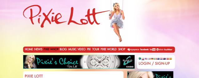
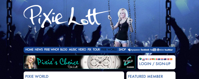
With every link you click on the back ground and colour scheme changes, adding variation to the web page as a whole, we will not need to do this as we are just creating the home page, but if we were to do so this would be a successful idea in my opinion because it keeps the audience's attention to detailing.
Here is a still from the 'Pixie World' page which again has a change in colour scheme but also reads that you have to be a member or signed up in order to visit this world. This is interesting because even though it is free to sign up, the audience have to commit to this web page for further information and gossip!

On the homepage i found it quite unconventional to see an artist promoting a product which isn't entirely theirs, here Pixie advertises the 'Baby-G' watch company not only in a banner at the top of the page, but also in a box to the right. Both of these advertisments are on the home page and are in a contrasting teal and black colour scheme as opposed to the pink and white of the general layout. This is a feature i would not want to use in our own web page.
Overall, the key highlights for me that i have taken into account for our product is the navigation bar links and general layout e.g) having the main headliner's name at the top, nav bar underneith, columns to the side and boxes underneith. This web page is easy to access which is a vital factor :)
Thanks for reading! Lorna.


No comments:
Post a Comment